Object properties
Every object (component, line-group, area etc.) on an Arcentry diagram is defined by a set of properties - which ones depends on the kind of object in question. This guide gives you an overview of the available types and properties and how to use them in the context of the API
Types
- component any cloud, open source or generic components. Components are identified by a unique componentId, e.g. database.postgres. Generic components support additional properties and can be identified by an id starting with generic, e.g. generic.block.
- line-group any line is represented as a line-group. Lines can be as simple as a single connection between two points and as complex as a multi-point, branching polyline with various arrowheads.
- label any text on the diagram is represented as a label
- area is a filled polygon - most often a rectangle.
- icon is a single, standalone icon. Icons on top of e.g. generic components are part of the component's properties.
- image is a flat image on the diagram. Images that are applied on top of generic components are defined as their properties.
- widget is any kind of interactive entity from the widget menu, e.g. a chart or a button (coming soon).
Properties in general
Properties are specified as JSON objects, e.g. 'backgroundColor': '#FF0000'.
Coordinates
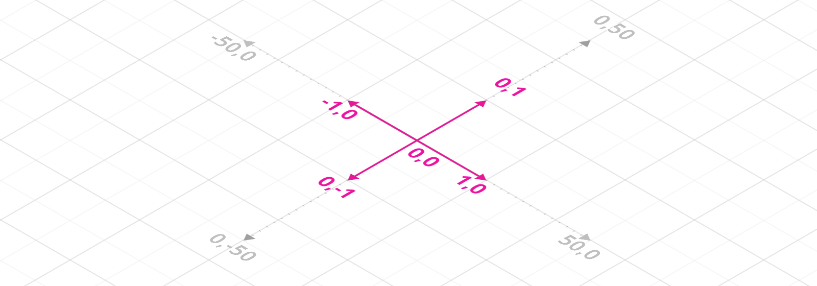
Arcentry objects are placed on a grid measuring 100x100 cells with an origin (the point with 0,0 coordinates) at the center. That means that coordinates can range from -50 to 50 for both x and y axis with each unit representing a cell on the grid. Units smaller than one cell are supported, but beware: different types can be moved at different resolutions:
- components, labels and anchor-points for line-groups are placed in half-cell steps (0, 0.5, 1, 1.5 etc.)
- area-anchors, icons, and images are placed in eights-cell steps (0, 0.125, 0.25 etc).
Colors
All colors are expressed as six-digit HEX strings with a leading #, e.g. '#CC33FF', other formats are not supported. The only exception is the special color #00000000 which stands for invisibility.
Components
Components have a mandatory id property that identifies which component it is.
{
      //required, identifies the component
      //please find the componentId for your component in the object data panel
      "componentId": "security.aws-secret-manager",

      // Replaces the default name (e.g. PostgreSQL)
      "name": "Public User Database",

      // Replaces the default description
      "desc": "Stores User and Account related data",

      // A list of links for this component
      "links": {
        "Open in AWS Console": "https://eu-central-1.console.aws.amazon.com/rds/home?region=eu-central-1#dbinstance:id=db2",
        "Open in Datadog": "https://www.datadoghq.com/app/#342af-543da"
      },

      //x and y coordinates on the grid
      "position": {
          "x": -6,
          "y": 6
      },
      // must be a multiple of π/2, e.g. 0, 1.5707, 3.141 etc.
      "rotation": 0,
      // can be 0.25, 0.5, 0.75 and 1
      "opacity": 1
  }
Generic Components
Generic Components can be customized to reflect your parts of the system.
Generic components can either have an image or an icon, but not both. To choose which one, set either imagePath or icon to null.
{
  //required, ids for generic components start with generic.
  "componentId": "generic.server",

  // Replaces the default name (e.g. PostgreSQL)
  "name": "Public User Database",

  // Replaces the default description
  "desc": "Stores User and Account related data",

  // A list of links for this component
  "links": {
    "Open in AWS Console": "https://eu-central-1.console.aws.amazon.com/rds/home?region=eu-central-1#dbinstance:id=db2",
    "Open in Datadog": "https://www.datadoghq.com/app/#342af-543da"
  },

  //position on the grid
  "position": {
      "x": -8,
      "y": 8
  },
  // must be a multiple of π/2, e.g. 0, 1.5707, 3.141 etc.
  "rotation": 0,
  // can be 0.25, 0.5, 0.75 and 1
  "opacity": 1
  // the color for the highlighted parts of the component
  "primaryColor": "#FFFFFF",
  // color of the component background
  "backgroundColor": "#202020",
  // the path to an image. Must point to an image stored by arcentry
  // set to null if icons are used
  "imagePath": "eb0c0d1e85ff7923c79ae307d86ecc/unicorn.png",,
  // color for the icon
  "iconColor": "#FFFFFF",
  // an icon code, set to null if imagePath is used
  "icon": "bomb"
}
Line Groups
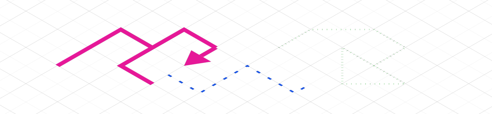
Line Groups are a bit trickier: Lines in Arcentry don't necessarily just go from A to B, but can branch off into more complex structures. To describe these, Arcentry uses two concepts: anchors and lines.
-
An anchor is a point that one or more lines can connect to. There's two type of anchors, distinguished by their 'type' property: standalone (type = 0) and object (type = 1).
A standalone anchor is a point identified by x and y coordinates
{
  "type": 0,
  "x": -9,
  "y": 3.5
}
An object anchor connects a line to a component. It doesn't have coordinates, but instead references the component's id and the index of its anchor point it connects to.
{ "type": 1, "index": 2, "id": "1clr7a9cn-pc3rjgomb" } -
A line is a segment that connects two anchor points. Lines are array with two anchor indices, e.g. [3,6]
Let's look at some examples:
A simple line from A to B
{
  "strokeStyle": "#E61898",
  "lineWidth": 0.075,
  "lineDash": 1,
  "arrowAnchorIndices": {},
  "anchors": [
    {"type": 0, "x": -2, "y": 14},
    {"type": 0, "x": -2, "y": 12}
  ],
  "lines": [
    [0,1]
  ]
}
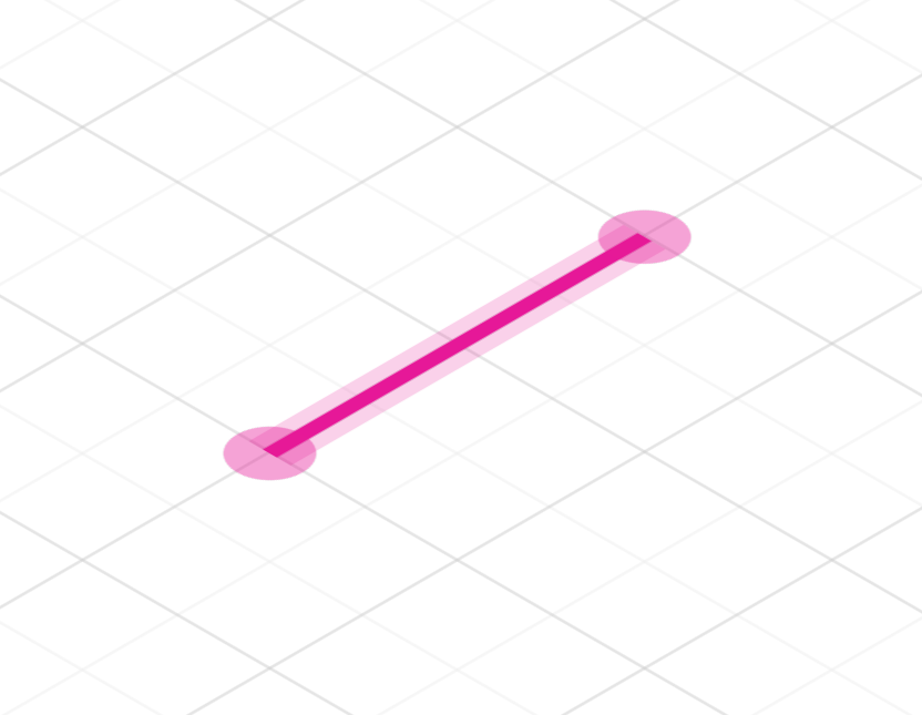
To draw a simple line between two points, create two standalone anchorpoints (type=0) and one line entry connecting both [0,1]
A line connecting to a component
{
    "strokeStyle": "#E61898",
    "lineWidth": 0.075,
    "lineDash": 1,
    "arrowAnchorIndices": {},
    "anchors": [
      { "type": 0, "x": -3.5, "y": 9.5 },
      { "type": 0, "x": -3.5, "y": 7.5 },
      { "type": 1, "index": 7, "id": "1clrg6f31-iqvmoa49l" }
    ],
    "lines": [
      [0,1],
      [1,2]
    ]
}
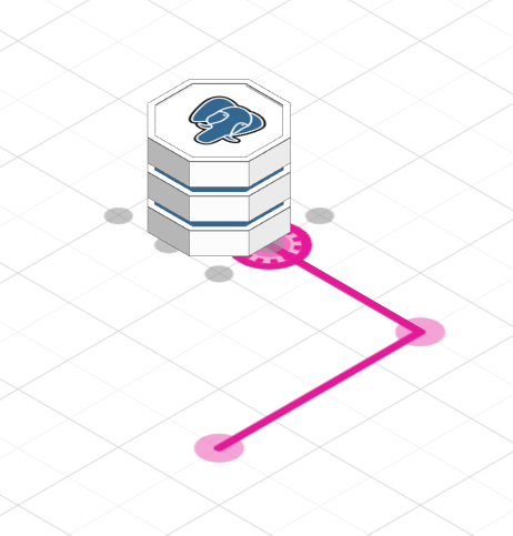
Here a line goes through two anchor points and finally connects to a component with id '1clrg6f31-iqvmoa49l' at anchorpoint index 7. (Component anchors start at 0 in the top-left corner and increase clockwise). This allows the line to stay connected to the component when either is moved.
A branching line
{
  "strokeStyle":"#E61898",
  "lineWidth":0.075,
  "lineDash":1,
  "arrowAnchorIndices":{"3":true,"5":true,"6":true},
  "anchors":[
      {"type":0,"x":-5,"y":8.5},
      {"type":0,"x":-5,"y":6.5},
      {"type":0,"x":-6,"y":6.5},
      {"type":0,"x":-6,"y":5},
      {"type":0,"x":-4,"y":6.5},
      {"type":0,"x":-4,"y":5},
      {"type":0,"x":-5,"y":5}
  ],
  "lines":[
      [0,1], [1,2], [2,3],
      [1,4], [4,5], [1,6]
  ]
}
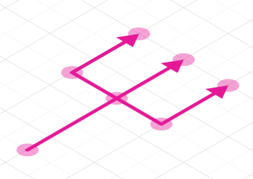
Here the line forks at a central anchor point (index: 1). Note the arrowAnchorIndices objects which specifies which anchor points end in an arrow tip.
All Line Group Properties
{
    // The color of the line
    "strokeStyle":"#E61898",
    // The width of the line. Possible values are 0.025, 0.05, 0.075, 0.1, 0.125
    "lineWidth": 0.075,
    // 1 = solid, 2 = dashed, 3 = dotted
    "lineDash":1,
    // An object listing the anchor points that end in arrows
    "arrowAnchorIndices":{"3":true,"5":true,"6":true},
    // Array of anchors
    "anchors":[
      // Standalone anchor
      {"type":0,"x":-5,"y":8.5},
      // Object anchor
      { "type": 1, "index": 7, "id": "1clrg6f31-iqvmoa49l" }
    ],
    // Array of lines from anchorpoint index to another anchorpoint index
    "lines":[
        [0,1]
    ]
  }
Areas
Areas are defined using a linear series of anchor points with x and y coordinates.
{
    // an array of anchor points. Anchor points always form closed polygons
    "anchors": [
        { "x": 7.75, "y": 5.5 },
        { "x": 8.375,"y": 5.5 },
        { "x": 8.25, "y": 6 },
        { "x": 9.5, "y": 6.5 },
        { "x": 7.75, "y": 6.5 }
    ],
    // The color the area is filled with. Use #00000000 for no fill
    "fillColor": "#BFBFBF",
    // The color of the area's outline. Use #00000000 for no outline
    "lineColor": "#606060",
    // the width of the area's outline. Possible values are 0.025, 0.05, 0.075, 0.1, 0.125
    "lineWidth": 0.05,
    // The height of the drop shadow underneath the line. Possible values
    // are 0 (none), 1, 2 and 3
    "shadowLevel": 1,
    // Indicates the stacking order for multiple stacked areas on
    // top of each other
    "zIndex": 0,
}
Icons
Arcentry uses a subset of the Font Awesome icon set. Please find a list of available icons here.
{
  // the type of the icon.
  "icon": "heart",
  // color of the icon itself. Use #00000000 for transparent icons
  "color": "#E61898",
  // size of the icon. Supported values are 0.25, 0.35, 0.5, 0.7 and 1
  "fontSize": 0.5,
  // position of the icon on the grid
  "position": {
      "x": 8.25,
      "y": -0.75
  },
  // Rotation as a multiple of π/2
  "rotation": 4.71238898038469,
  // Color of the icons outline. Use #00000000 for no outline
  "outlineColor": "#00000000"
}
Images

Images must be uploaded to Arcentry before they can be used.
{
    //Position of the images top left corner
    "position": {
        "x": -10,
        "y": 13.875
    },
    //dimensions of the image
    "dimensions": {
        "width": 1.625,
        "height": 1.125
    },
    // path to the image stored by Arcentry
    "path": "eb0c0d1e85fcd77a5f679ae307d86ecc/unicorn.png",
    // If true, the image will fill be stretched to the provided dimensions
    // If false, the images aspect ration will be retained
    "stretchToSize": false,
    // Rotation as a multiple of π/2
    "rotation": 0
}
Widgets
Widgets in Arcentry are (or more precisely will be, we've just introduced them :-) a collection of visualization and interactive components, each with their own functionality and data-schema.
Charts
{
// Currently only "chart" is supported
"widgetType": "chart",
// Determines where the chart gets its data from. Valid values are "api" or "cloudwatch"
"dataSource": "cloudwatch",
// The data for the chart, only applicable if dataSource === "api".
// Data is expected to be an array of arrays with two entries, one for x and one for the y axis
// For time based charts, please provide a second or millisecond timestamp as the first value for
// each entry
"data": [
[ 1, 34 ],
[ 2, 43 ],
[ 3, 12 ]
],
// Only applicable if dataSource === "cloudwatch".
"monitoring-aws-cloudwatch": {
// For charts, metrics can only hold a single key
"metrics": {
// This is a random id - if creating a chart via the api just pass
// metric-
"metric-1crb317bl-qkveqteod": {
// the time span for the chart, can be 1H, 4H, 8H, 1D, 2D, 3D, 1W
"span": "3D",
// the cloudwatch metric you'd like to display. For more on
// cloudwatch metrics, namespaces and dimensions please have a look at
// https://docs.aws.amazon.com/AmazonCloudWatch/latest/monitoring/cloudwatch_concepts.html
"metric": "ReadIOPS",
"namespace": "AWS/RDS",
"statistic": "Average",
"dimensions": [
{
"Name": "DBInstanceIdentifier",
"Value": "rds-db-small"
}
]
}
}
},
// Only applicable if plotType === "line". Determines if the area under the line shoud be filled
"fillChart": true,
// Color for line and bar charts
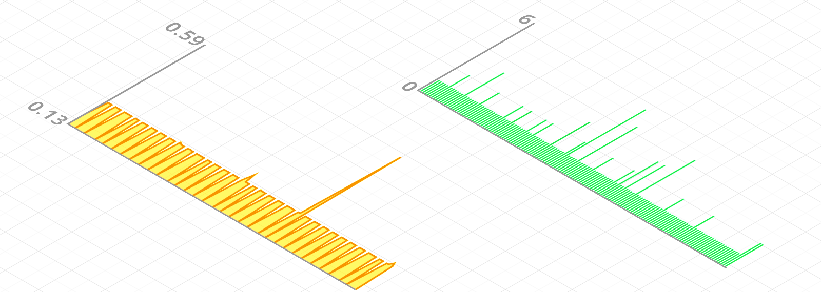
"lineColor": "#F79400",
// Determines whether labels for the yAxis should be displayed
"showLabels": true,
//Can be "auto" or "custom". If auto, the min and max values for the y axis are set automatically
"yAxisSpace": "auto",
//Sets min and max values for the y axis if yAxisSpace === "auto"
"maxY": 0.59,
"minY": 0.13,
// Can be "line" or "bar"
"plotType": "line",
// The position of the top left corner of the chart
"position": {
"x": -9.125,
"y": 2.125
},
// Size of the chart
"dimensions": {
"width": 8.875,
"height": 4.375
}
}